

Young Roots
Heuristic
Evaluation


Project Type
Academic / Group

Role
Lead UX Designer

Tools
Figma, Canva

Duration
5 Days

Design Challenge
Through a collaborative heuristic evaluation, we assessed Young Roots' website to identify areas for improvement in user experience and information architecture. Our goal is to enhance the website's layout to ensure clarity on how donations are used and provide a seamless donation process for potential donors, in order to help achieve the companies mission of having 100 monthly contributors.

The Problem
Young Roots is a charity dedicated to supporting young refugees in the UK, seeking to expand its base of monthly donors. However, their current website presents challenges in achieving this goal. The information regarding how donations are used lacks clarity and engagement, while the donation process itself could be more streamlined and user-friendly.
Research
Researching the Company

Young Roots is a London-based charity that in 2022 provided essential casework services, legal aid, therapeutic support and English mentor sessions to around 873 young refugees and asylum seekers form 45 countries.
Company’s Mission

“This year, we aim to build a community of 100 supporters who pledge a monthly donation to Young Roots. Become part of our community, supporting young people to feel safe and empowered as they rebuild their lives: Be 1 in 100”
Heuristic Evaluation
What can be Improved?

Upon reviewing the current website, it was clear that there was a lot of room for improvements.
The charity's website currently lacks the necessary information and a coherent pathway to realize this objective.
The initial design of the website needed a visual overhaul, but also improving the donating process as it required to fill out a lengthy detailed form rather than a simple transaction process.
It was also hard to find out information on how and where the donation amount will
be allocated.
Interviews
What do Users really think?
To gain a deep understanding of the challenges and pain points faced by potential donors, we conducted extensive user research. This involved engaging in one-to-one and online discussions with our target audience. Through these conversations, we were able to uncover a range of recurring issues that hindered the donation process. Some of the key challenges identified included:
Complex donation forms: Overly lengthy or confusing donation forms that discouraged users from completing the process.
Lack of transparency: Uncertainty about where donations go and how they are used.
Lack of trust: Concerns about the credibility of the charity and the security of personal information.
Limited donor recognition: A lack of acknowledgment or appreciation for donors, making them feel undervalued.
By uncovering these challenges, we were able to focus our design efforts on addressing these specific pain points and creating a more user-friendly and effective donation experience.
C.B, 31
Consultant
“It takes me a while to find how they will use the funds”
Y.C, 36
Civil Servant
“Process of donating can be a bit long”
N.C, 32
Data Scientist
“I don’t typically
remember to donate regularly”
M.C, 31
Recruiter
“I don't enjoy receiving
so many email updates”
M.L, 32
Customer Service
“I don't want to give you
my data. Just take my money”
A.R, 34
Lawyer
“I would like to know
more about donation allocation”

“How might we increase awareness of Young Roots’ current goal of creating a community of 100 monthly donors and make the donation process more engaging for potential donors to achieve (and surpass) the target?”

The Solution
To empower potential donors and maximize their impact, Young Roots' website requires a strategic redesign. Our goal is to create a seamless and cohesive user experience with a clear information structure throughout the website. Additionally, we aim to significantly enhance the donation process. This will involve providing detailed explanations of how donations are used, and showcasing the specific ways in which they directly help young refugees.
Persona
Understanding the Target Audience

Concept Sketches
Crazy 8’s

Using the Crazy 8’s design process, we were able to quickly create a series of sketches of what we thought would be useful to include within our envisioned redesign that would create the biggest impact for our users by showing clear information and a seamless donation process.
Wireframing
Initial Wireframe Design

User Testing
Optimizing the User Experience
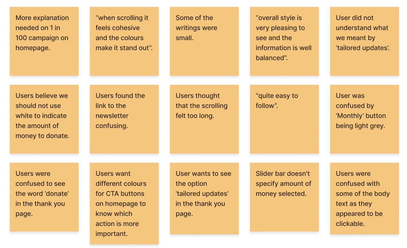
From the user testing of our target audience, we found a few key issues that needed to be addressed. One of which included the over use of donation buttons on the homepage which seemed to deter users off the donating process.
Another key change was a more seamless donation process with the optional extra if they wanted to be updated of how their donations are helping either by email or other means.

Final Prototype
Presenting the Solution

Leveraging insights from the user testing, we implemented the changes to the prototype. Prioritizing the most effective features, we refined the donation experience to maximize user clarity and impact. This ensures users can donate seamlessly while feeling confident about their contribution's purpose.
Next Steps & Key Findings

Refine the UI design
Further develop donation system/interactions
Develop website branding to
increase confidence and user engagement

Effective communication and collaboration is crucial
We had to be agile during the
week's sprintWe also realized that early sketching is key
Observing user interact with our initial prototype provided essential insights